

Instagram rolls out black and white UI to some users
http://xpeco.blogspot.com/2016/04/instagram-rolls-out-black-and-white-ui.html
Instagram seems to be testing a completely revamped UI for its app. A few users have tweeted about their app turning completely grayscale, save for the images, of course.
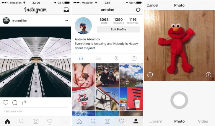
For most parts, the new design is similar to the current one. What is different is that Instagram has dropped the blue bar at the top and the distinct square buttons at the bottom. The bar at the top is now plain white with black text and icons. The bar on the bottom loses its borders for buttons and instead has simplified iconography. This simplification of icons and monochromatic theme continues elsewhere in the app as well.
So far we have only see these from iOS users, but if Instagram does go with this design then it's likely the Android app will be updated with a similar look as well. Instagram hasn't said anything yet officially about the update, which means it is simply testing waters at this time.
 Click on The Image & Start Earning !


