iOS 10 Review
http://xpeco.blogspot.com/2016/10/ios-10-review.html
/cdn0.vox-cdn.com/uploads/chorus_image/image/50969131/ios10.0.jpg)
There's a very good chance that you've already installed iOS 10, the latest operating system for Apple's iPhone and iPad. Apple is much better at getting devices upgraded consistently than Google is, so reviewing it is a little different than other operating systems like Android, Windows, or even macOS. When you read those reviews, the question is "Do I want to install this thing?" When you read an iOS review, the question is "What am I in for now?"
What you're in for (and what many of you are already experiencing) is an evolution of some of the design and interaction ideas that Apple has been working on for a couple of years now. iOS 10 moves some of your stuff around a little and makes other stuff look a little different, but fundamentally it acts very much like what you're used to underneath those new notification bubbles and 3D Touch gimmicks.
But layered underneath those cosmetic changes are some features that push your apps even further, beyond just their icons, into various corners of the operating system. It's easy to look down your nose at Widgets and iMessage stickers, but when they’re combined with extensions, you begin to see a system where you have access to information from ESPN, Weather, Uber, and much more, all without opening those apps at all. It’s like Android’s widgets, but with a developer ecosystem that might actually be incentivized to support them.
When you do open Apple's core apps, you'll find it's a mixed bag. Some, like Mail, have had the bare minimum applied to them, but seeing what Apple has focused on is telling. The biggest changes come to iMessage, Photos, Music, Maps, and News: activities that are all more central to how we use our phones now than ever before.
Put the changes inside those apps together with the way any app can express itself outside the confines of its icon, and a picture begins to finally come into focus. We’ve always known that Apple thinks iOS is the future of how computers should work, and with iOS 10 it’s starting to become more than just a promise.
Lock screen and notifications
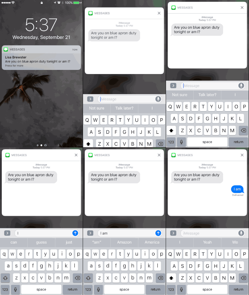
When we first tried out the iOS 10 Beta, it was the lock screen's new changes that impressed us most. In iOS 10, Apple has eliminated the Slide to Unlock feature that was one of the defining (and heavily litigated) features of iPhones since they were first announced. Instead, you'll use Touch ID and press the home button to unlock. It's different, and it takes a little getting used to.
The screen wakes up as soon as you lift your phone up, showing your notifications straight away. To unlock, you press the home button. But here's a pro tip to try if you don't like it: dig into settings under General -> Accessibility -> Home Button and toggle "Rest Finger to Open." That lets you unlock the phone without pressing in on the button itself. It’s a nice half step between the old swipe-to-unlock and the new way, and if you’re like me, it will make a little more sense. Think of it like the iPhone equivalent of refusing to switch to natural scrolling.
But the bigger change to the lock screen is how it handles notifications: they've been overhauled all over the OS, and the lock screen gets those benefits. They look different now — they're discrete bubbles — but more importantly, developers can make "Rich notifications" that allow certain apps to basically embed themselves in a notification.
3D Touch down on a notification and tap reply on an iMessage, for example, and instead of just getting a reply box, it pops up a view of your conversation so you can better reply in context. Calendar shows you a view of your day when you get a meeting reminder. Maps shows, well, a map. It's all really smart and keeps you from playing the classic home button to home screen to app and then back again game every iPhone owner is so familiar with.
Not so smart: Apple still hasn't figured out that these interactions ought to be consistent. On the lock screen, you swipe left on a notification to open an app. On the notification shade, you just tap — swiping brings up the "Today View" with your widgets. When you're scrolling through a giant list of notifications, the two screens look identical, so you will sometimes end up doing the wrong thing. Even though Android doesn't have these little embedded apps in notifications, at least you always know what's going to happen when you swipe on one, no matter where you are.
/cdn0.vox-cdn.com/uploads/chorus_asset/file/7144451/notification-big2.0.gif)
Widgets
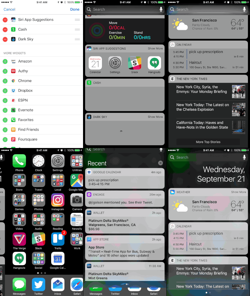
As for the Today View, it makes much more sense now than it used to. It shows up in three places: the left of the home screen, notification pane, and lock screen. It's a place for you to put all your widgets for weather and news and whatever else, replacing Apple's own half-baked attempts with the old Siri predictive screen. Apple’s own apps have a bunch of widgets ready for use and there are third-party widgets already available, too (because they were there on iOS 9). But they’re easier to find now. One weird bit: third-party widgets have a dark background — possibly because so many were designed for the old, darker widget system.
Phone makers have been trying to make widgets a thing since time immemorial (aka Pocket PC 2000), but with limited success. So while I want to say Apple nailed it in iOS 10, I've learned from hard experience that we won't know if these widgets will be used more and supported better than the widgets we've seen for the past 15 years on every mobile platform.
When you use 3D Touch on certain app icons, they can also display little widgets. And Control Center also lets you use 3D Touch on the bottom row of icons (which, frustratingly, you cannot change) but not (again, frustratingly) the system toggles on the top. It’s split into two, sometimes three panes. The first is for system controls, the second for audio controls, and the third (if you need it) for smart home controls. I'd say that last panel is a big deal, except the smart home ecosystem is still very far from being a big deal itself yet. But if it ends up mattering, iOS 10 will be ready.
Siri
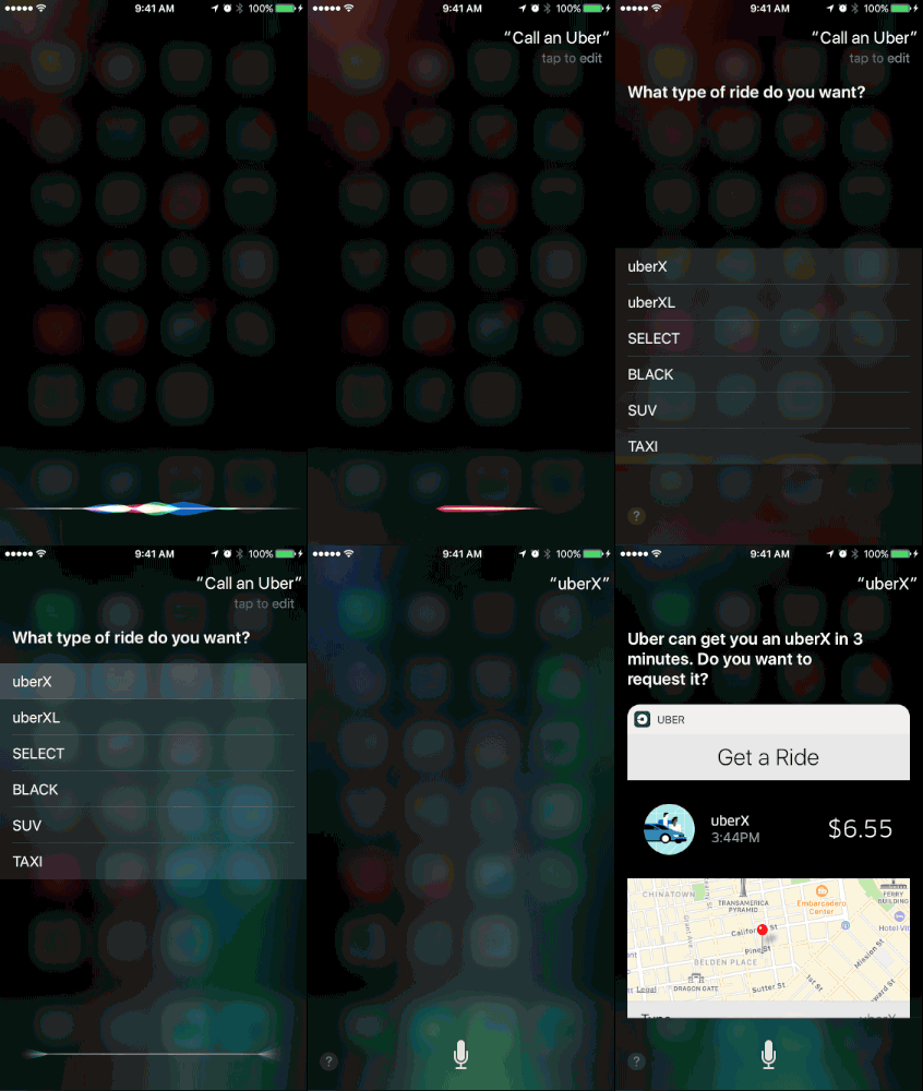
Siri now integrates third-party apps — which is really important, but Apple is starting slow. Only a few classes of apps can be controlled by Siri: calls, messaging, payments, photos, ride-sharing apps, some CarPlay systems, and workouts. On my iPhone, Square Cash, LinkedIn, OpenTable, Uber, WhatsApp, and Yelp are all options inside Siri. The fact that Apple is opening up Siri and making the process for app developers transparent is great — even Google hasn't done that yet; itsintegrations still require direct partnerships with the company.
You can find a list of your apps that support Siri deep in settings; so far I've sent some WhatsApp messages and called an UberX. Sending payments and booking restaurants also works, but often the final step has you tapping a button inside Siri to finish the process inside an app (or least, that’s what happened with Square Cash and OpenTable).
You still can only use Siri with voice and can’t type at it. I still don’t understand why.
Beyond the new app integrations, Siri doesn't seem to have gotten a whole lot smarter than you remember. Apple may have a small lead on Google when it comes to opening up to third-party developers, but it still could use some work turning the messy internet into coherent bits of useful information.
iMessage
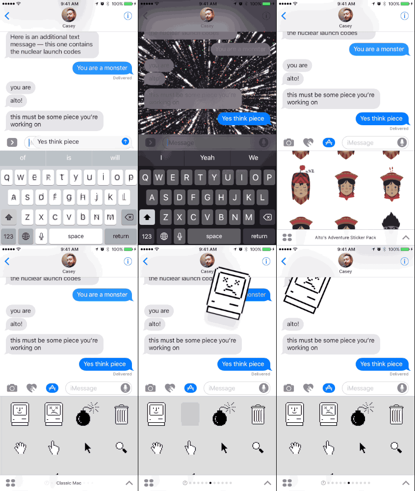
Do you want your messaging conversations to be staid, straightforward interactions of text and images? Well, iMessage can do that, but I'm getting the sense it doesn't want to anymore.
Instead, Apple is learning from competing apps like Line, Messenger, and Snapchat by adding a host of new features and capabilities. Most interestingly, iMessage is becoming a platform all its own. There are third-party apps, stickers, crazy confetti effects, and emoji all over the place. You can drag stickers up and slap them on previous messages (which could make you look like a jerk). You can embiggen your texts so they slam on the screen when you send them. You can turn your phone sideways and scribble out notes — then send them with the "invisible ink" option so your recipient has to manually reveal them. You can search for GIFs (but be careful out there) that get your point across. You can draw on photos before you send them.
Is it all easy to understand? Hell no, but if we've learned anything from Snapchat, it's that difficult-to-use interfaces are actually a feature, not a bug. The basics are easy, and if you want to go bonkers you can hunt the rest down. Depending on who you're chatting with (and depending on your own proclivities), your chats could become a multimedia nightmare of stickers, drawings, audio clips, GIFs, heart beats, kisses, and laser effects. Or maybe that's a wonderland, not a nightmare. Your call.
There are also more full-featured apps in iMessage, but so far color me less than impressed with them. More often than not they open up tiny little app windows instead of feeling like they're integrated inline with your chat. The ones that work best are those that just let you perform a quick, simple task — Walt Mossberg and I traded five bucks with each other via Square Cash and the whole thing just worked from inside the space where the keyboard usually is.
For people who don't want all that, there are still benefits to the new iMessage. Links automatically get small previews inside the chat window, for example, and in general the app does feel a little faster than before.
Photos, Maps

Much has been made of Apple's take on machine learning — it's done locally, on your device, instead of in the cloud as Google does it. In the Photos app, the difference between those two different philosophies is the most stark. Apple Photos tries to analyze everything and present you with many of the same features that we've seen on other, cloud-based platforms: robust search based on image analysis and "Memories" that show you old photos from a year or three ago.
In both cases, I'm impressed with what Apple is able to do without leaning on a server farm, but not so much that I'd say it's on par with Google Photos. Searches for things like "whiteboard" and "cat" bring up results, but with a higher error rate on what it shows and a miss count on stuff it should have compared to Google. It could be that I need to give Photos yet more time to analyze my library.
I'm more impressed with Apple's photo editing tools in iOS 10. They won't hold up to some of the more professional apps out there, but Apple has done good work taking complex photo editing concepts and abstracting them down into simple sliders like "brilliance." Another nice touch: iOS 10 maintains Live Photos even after you've edited them, which means you can retouch your little movies before you make a GIF in Google's Motion Stills app.
Speaking of places where Apple and Google go head-to-head, Apple Maps has also been overhauled in iOS 10, and for the better. Apple has put a slider on top of the map canvas, on the bottom, and generally cleaned up the way it displays pins and locations on the map itself.
The navigation view is also better and allows you to search along the route — and the CarPlay navigation view is a little more robust now, too. It can connect to restaurant apps and ride-sharing apps, a feature that has quickly gone from "hey neat" to must-have.
Is it enough to take Google Maps off my home screen? Nope, but it's getting close. Google's biggest advantage now is that it's the de facto standard across the rest of the computing world. Having a good web app will do that — and though I know it's a pipe dream, I wonder what would happen if Apple decided to take a year off from making iOS and Mac apps and ported more of its suite to the web. I know, I know: what a nutty idea.
Music
Apple Music has been overhauled in iOS 10, entirely for the better. The "Connect" tab, a little feed of content from your favorite artists, has been sent off to live with Ping on the island of forgotten Apple social ideas.
More importantly, the overall navigation and organization of the app has been clarified and cleaned up. Like Spotify, Apple Music is trying to be at least two things at once: a place to navigate your own music library and a place to discover new music via a subscription service. I don't think either has fully figured out how to square that circle, but the latest version of Apple Music is getting close to being on par.
I still prefer Spotify myself, mainly because it seems to offer me better new music than Apple does. But Spotify is apparently going to be missing out on Apple Music exclusives on the regular, which could drive people to switch.
The new "Now Playing" screen is also simplified, just don't forget to scroll up a bit to get options like lyrics and the shuffle / repeat buttons.
Other Apps
Apple News continues to exist, now with breaking news notifications from key partners (Disclosure! The Vergeand Vox Media are partners in Apple News). I could see somebody using this instead of Flipboard or an RSS reader, but I can't see enough people using it to make it a Facebook-style force in the news industry. It's there, it's fine.
Speaking of fine: Apple Mail. I'm elated that it finally does a decent job threading emails into a single, scrollable pane of messages. I'm less elated by everything that hasn't been updated. I couldn't imagine using a mail client that doesn't offer a "snooze" function anymore, and there are too many good options out there that offer it to consider sticking with Apple Mail.
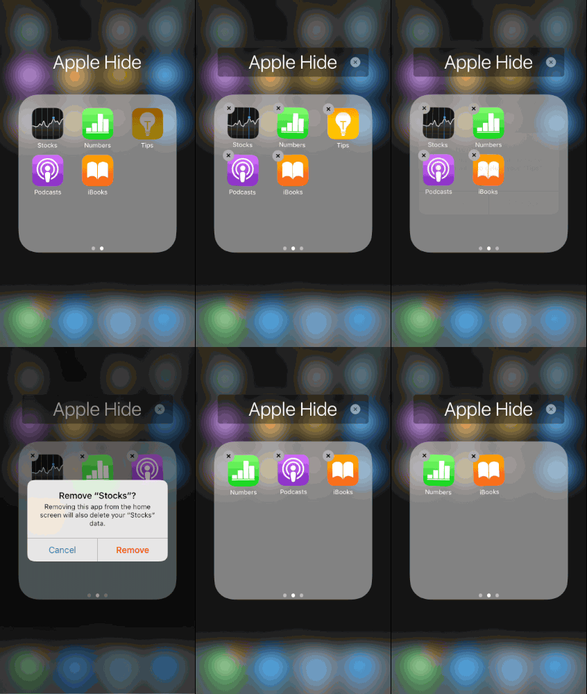
But hey! You can delete it and many other core Apple apps. But before you go deleting, know that all you're really doing is cleaning up your home screen. Apple saysthat "removing built-in iOS apps doesn't free up storage space on your device." And even if you delete an app like Mail, it doesn't mean you can set up another one to fully replace it. Delete Mail and then tap an email address — the iPhone pops up a warning telling you to reinstall Mail.
Still a walled garden, but with more doors
ast year, a few of the newest 3D Touch iOS features were limited to the iPhone 6S. This year, you don’t need to upgrade to an iPhone 7 to try out the new stuff — and even people with older phones have some workarounds to get to the 3D Touch-enabled functions. AsJoanna Stern said over at The Wall Street Journal, it’s enough that you don’t really need that new phone.
With iOS 10, you can clearly see that Apple understands what it wants a phone to be in 2016. You can see that vision when it chose to update its own apps. It's the thing we use to talk to each other, to take pictures, to listen to music, and to find our way around. But it can also be so much more, and so Apple has expanded the platform, giving us tiny windows into those apps all over the OS. It's not quite the productivity powerhouse (especially on the iPad) that some would like, but it's very much Apple's vision of computing.
iOS 10 offers more places than ever for apps: iMessage, Siri, Extensions, Maps, CarPlay, Widgets, and 3D Touch Widgets. But this is still Apple, and it is still precious about making its own stuff the default. Which is its right, but with so many other options available for developers, it's weird (and frustrating) to see Apple hold out on those last few things, like default apps.
At their best, operating systems are platforms for other apps and services to build on instead of collections of apps made by a single company. And Apple has done that with iOS 10, just in its own way. Sure, it will take a while for your favorite apps to take advantage of the new features (if they ever do so at all), but if developers are smart, they'll be thinking about those new canvases. Because now, nobody can reasonably complain that the iPhone’s software is a boring old "73 degrees and sunny" anymore.


 Click on The Image & Start Earning !


